 Block Statistics Live
Block Statistics Live
Block Statistics LiveThis control element shows up to eight measured values as a running chart – for instance the momentary power of individual devices. Values are only recorded while the chart is open; it is therefore suited to watching fast changes. For a history over days or years use the Block Statistics, whose values are recorded by the controller.
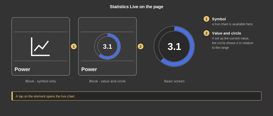
A tap on the element opens the live chart.
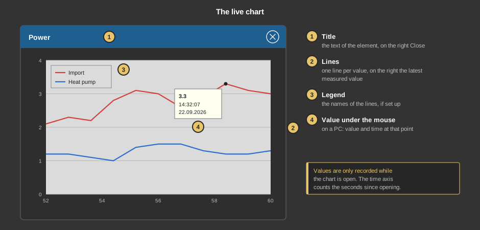
The time axis follows the new values until the chart is dragged or zoomed with the finger or the mouse; a double-click makes it follow again. The button Lines at the bottom opens the selection of the lines – a tick means the line is shown.
Closing the chart ends the recording. The next time it is opened, the chart starts empty again, with the current value of each line as the first point.
This section is meant for the installer of the system.
The control element needs no function block. The measured values are linked directly at the control element under the variables (right-click the control element). The lines are set up with the button Parameter.
Display |
|
| View | Block or Basic Screen. The third choice List(deprecated) comes from older projects and should no longer be used. |
| Text | Caption of the tile and title of the chart. Default “Statistics Live”. The size scales with the element, a line break is inserted with \n, two lines at most. |
Chart |
|
| Background / Font | Colours of the chart. |
| Legend | Shows the names of the lines in the chart. Default off. |
| Scaling min. / max. | Fixed range of the Y axis. If both are 0, the axis is scaled automatically. |
| Decimal places Y | Decimal places of the Y axis labels. |
| Parameter | The button “…” opens the settings of the lines, one row per linked value: Name (in the legend), Type (Linear, Rectangle, Linear+filling, Rectangle+filling or Bar), Line thickness and Line color as well as Factor and Offset. Drawn is value × factor + offset; a factor of 0 counts as 1. The tick Active is saved, but the chart always shows all linked lines. |
Progress/value |
|
| Show | Do not show (default: symbol only), Value+Progress or Value only on the tile. The other settings of this section only appear when something is shown here. |
| Format | Format of the number, see Format specifications. Default %.1f. An empty format hides the number. |
| Type | Linear: the circle fills with the value in relation to the span from minimum to maximum. Plus/Minus: positive values fill the right half of the circle up to the maximum, negative ones the left half up to the minimum – for instance for import and feed-in. |
| Minimum / Maximum | Range of the circle, default 0 to 100. |
| Factor | The value of the variable Value display is multiplied by this factor, for instance 0.001 from watts to kilowatts. It acts on number and circle; 0 counts as 1. Default 1. |
| Positive + / Negative - | Colours of the circle for positive and negative values, default blue and red. |
| Value display | Optional. Value for the number and the circle on the tile. Not linked: no number is shown and the circle stays empty. |
| Value 1 … 8 | The measured values of the lines. Value 1 must be linked, the others are optional. They are used in order without gaps: after the first value that is not linked, the following ones are not drawn either. |
See also General properties of all control elements.