 Block System settings
Block System settings
Block System settingsThis control element brings the most important functions of the toolbar of the APP onto a page: show and hide the bar, choose another connection, open the settings and exit the APP. This is useful when the toolbar is hidden – for instance on a permanently mounted operating panel where not everybody shall reach the settings.
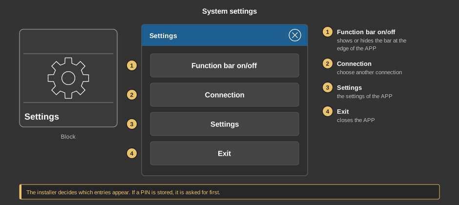
A tap on the element opens the dialog. If a PIN is stored, it is asked for first; with a wrong entry the dialog stays closed.
An entry is carried out when the finger is lifted; moving the finger away from the entry first cancels it. The installer decides which entries appear. In the Studio the dialog opens, but the entries only act in the APP.
Tip: If the toolbar of the APP is hidden, it comes back when you keep a finger anywhere on the visualization for 15 seconds.
This section is meant for the installer of the system.
Display |
|
| View | Block or Basic screen. |
| Text | Caption of the tile. Its size scales with the element, a line break is inserted with \n, two lines at most. Default “Einstellungen” (settings). |
Menu |
|
| PIN | Optional, four digits. Asked for before the dialog appears. Empty: no PIN. |
| System menu | Shows the entry Function bar on/off. Default on. |
| Connection | Shows the entry Connection. Default on. |
| Settings | Shows the entry Settings. Default on. |
| Exit | Shows the entry Exit. Default off. |
Tip: If the tick Background under transparency is removed, only the symbol remains in the basic screen – that makes it easy to lay the element over another one.
See also General properties of all control elements.