 Block Switch universal
Block Switch universal
Block Switch universalThis control element is a simple button with the states on and off – for switching, as a push button or to send a fixed value. It adapts to the style of the block control elements and is therefore well suited to build your own control elements in block style together with the Block Frame. On request a PIN is asked for before switching.
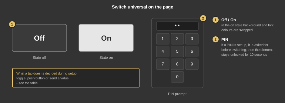
What a tap does depends on the setup:
Short tap |
|
| Toggle | Every tap toggles: if the element is on, it goes off, otherwise on. |
| Push button | As long as the finger rests on the button it is on; when released it goes off again. |
| Value on | Every tap switches on – switching off happens elsewhere, for instance by the device itself. |
Long press |
|
| Toggle | After holding for 1.5 seconds it toggles. A short tap does nothing – so nothing is switched by accident. |
| Push button | After holding for 1.5 seconds the button goes on, when released off again. |
| Value on | After holding for 1.5 seconds it switches on. |
Note: a long press is not possible on every device – under Windows in tablet mode, for instance, the operating system handles a long press on the screen itself.
This section is meant for the installer of the system.
The control element works without a function block, the variables are linked directly at the control element. It counts as on if the value of the variable equals the parameter Value for on, otherwise as off. This way, for instance, 0 and 100 can also be sent as off and on.
Display |
|
| Use style | When ticked (default), background and font colour are taken from the active style; the parameters Background and Font are then hidden. |
| Text off / Text on | Caption in the state off or on, default “Off” and “On”. Its size scales with the element, a line break is inserted with \n. |
| Background / Font | Colours, only when Use style is not ticked. In the state on they are swapped. |
Function |
|
| Type value |
|
| Type switch | Short (default): the function acts on a tap. Long: the function only acts after holding for 1.5 seconds, see the table above. |
| Value for on | Value for the state on, default 1. Only if the value of the variable equals this value is the element shown as on. |
| Value for off | Value for the state off, default 0. |
| PIN | Optional, up to four digits. Empty (default): switching without prompt. |
Frame |
|
| Frame | See General properties of all control elements. |
| Switch | Value for on and Value for off are sent here. Without this variable a tap does nothing. |
| Status switch | Optional. Feedback of the device, it determines the state shown. Not linked: the value of the variable Switch applies. |
See also General properties of all control elements.