 Light/dimmer block
Light/dimmer block
Light/dimmer blockThis control element switches and dims a light. On top of that it offers switching times, the behaviour on presence and absence, a presence simulation for the holidays and an operating hours counter for maintenance.
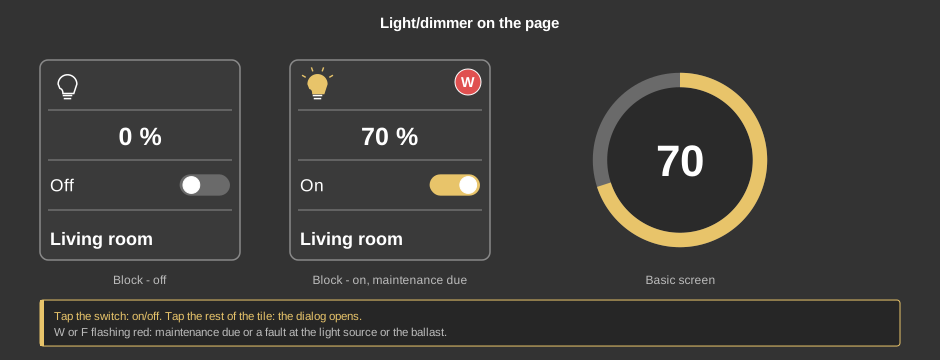
The tile shows whether the light is on and how bright it is. A tap on the switch turns the light on or off, a tap on the rest of the tile opens the dialog. In some visualizations the element appears as a circle instead (basic screen) – there a tap opens the dialog; if it has been set up that way, a short tap switches the light and only holding it longer opens the dialog.
If a red circle flashes at the top right, something needs doing: W means that the configured operating time has been reached and maintenance is due, F reports a fault at the light source or the ballast. The dialog shows what exactly is wrong.
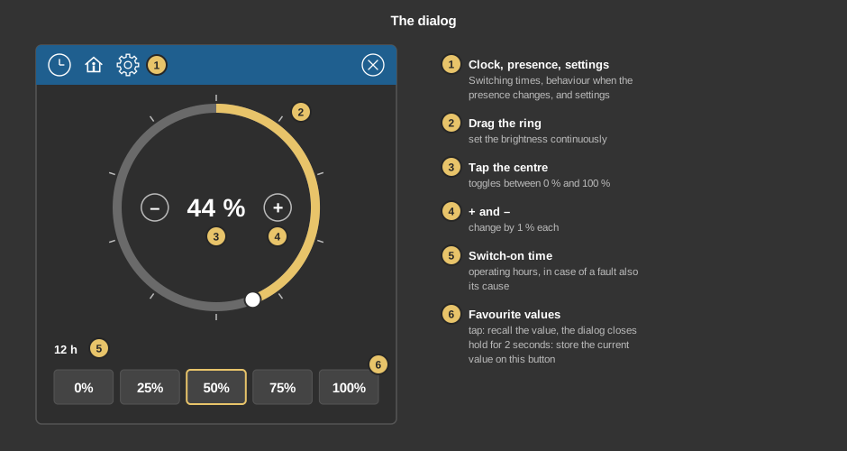
If the light can only be switched and not dimmed, the dialog shows a single On/Off button instead of the ring.
The clock leads to the switching times – for instance setting the light to 50 % every evening at 6 pm, optionally only when it is dark. The house holds what should happen when the presence changes: switch off when leaving the house, a certain value when coming home, on request only when it is dark. Both are the same for all Block control elements and are described in detail under Presence.
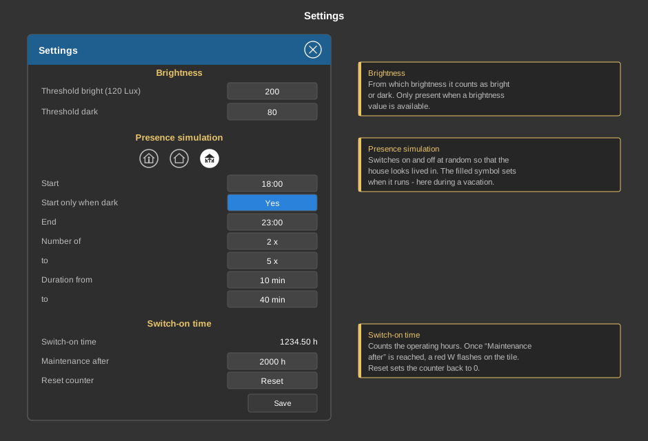
The gear opens the settings. Save applies them.
| Brightness | Sets from when it counts as bright or dark: Threshold bright and Threshold dark, each in lux. The brightness currently measured is shown in brackets. The threshold applies to all settings of this element in which “If bright” or “If dark” can be chosen. The section only appears when a brightness value is available. |
| Presence simulation | Switches the light on and off at random so that the
house looks lived in. The three symbols select in which state it
runs – usually vacation.
|
| Switch-on time | Switch-on time shows the accumulated operating hours. Once the time under Maintenance after is reached, a red W flashes on the tile. After the maintenance Reset sets the counter back to 0 – a confirmation is asked first. |
This section is meant for the installer of the system.
The control element comes in two variants:
Tip: If the transparency of the element is 0, a tap anywhere on it opens the dialog. This way the element can be laid invisibly over an image.
Display |
|
| Scene selection | Sets whether the element is offered for selection in the control element Block Scene Group. |
| View | Block (tile with switch) or Basic screen (circle with the current value, for instance for a floor plan). |
| Text | Caption of the tile. Its size scales with the element. A line break is inserted with \n, for instance “Line1\nLine2”; two lines at most. |
| Text switch on / off | Caption next to the switch of the tile, default “On” and “Off”. The text matching the feedback Status switch is shown. |
| Switching in basic screen | Only visible with the view basic screen. If ticked, a short tap switches the light on or off, holding it for 0.7 seconds opens the dialog. Without the tick every tap opens the dialog. |
| Pause time telegram | Limits the send rate while dragging the ring: values are then sent at most every set number of milliseconds (0 to 5000 ms, step 100 ms). The last value on release is always sent. 0 switches the limit off. Tapping +/–, the centre or a favourite value is not affected. |
With the variant Operation presence all variables sit at the function block. With the variant Standalone the following are linked at the control element:
| Switch | Sent when the switch is tapped, 1 = on, 0 = off. |
| Percentage | Brightness value 0 to 100 %. Optional. Not linked: the element only switches, the dialog and the percentage display are omitted. |
| Status switch | Optional. Feedback of the actuator, it determines symbol and text of the tile. Not linked: the switching command sent last applies. |
| Status percent | Optional. Feedback of the brightness, shown on the tile and in the dialog. |
See also General properties of all control elements.