 Block Footer
Block Footer
Block FooterThe footer sits at the bottom of the page and is used for paging: dots show which of several pages you are on, favorites lead directly to pages you often need, and at the left the presence can be changed.
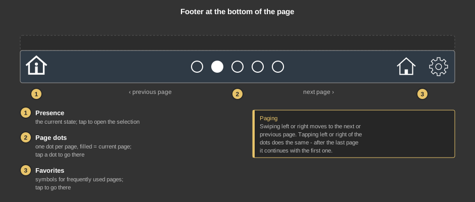
Paging: swiping left on the footer leads to the next page, swiping right to the previous one. If set up, this also works anywhere on the page as long as it is not zoomed. A tap left or right of the dots pages as well – after the last page it continues with the first one and vice versa.
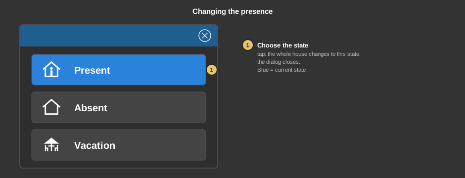
This acts exactly like the Block attendance; names of the states set there also apply here.
Tip: If the toolbar of the APP is hidden, it comes back when you keep a finger anywhere on the visualization for 15 seconds.
This section is meant for the installer of the system.
The footer is placed on every page that shall be part of the paging – easiest by setting it up once, copying it and pasting it into the other pages. The presence connects by itself to the function block Block Presence of the project; no manual link is needed. If the project has no Block Presence, the presence symbol is hidden automatically.
Colours and background come from the style (section footer), see Styles.
Page call |
|
| Presence | Show (default) or Hide: the symbol of the presence at the left edge. Without a Block Presence in the project it is always hidden. |
| Page change slide hor. | Paging by swiping left or right anywhere on the page. On the footer itself swiping always works. Default on. |
| Note user | The page is only changed if the user logged in is linked to the target page. A page without users is open to everybody. See User administration. Default off. |
| Favorites | The button ... opens the dialog Favorites for up to four entries. For each entry the target page is chosen (with the button or a right click) as well as a symbol for dark and light styles (Icon Dark / Icon Light); without a style Icon Dark applies. Favorite 1 is at the far right, the others follow to the left. An entry without a target page is not shown. |
| Pages | The button ... opens the dialog Pages: tick the pages for paging (with search field; if several lines are selected, one tick changes all of them) and set their order with the arrows. The order applies to the dots and to the paging. |
See also General properties of all control elements.