 Block header simple
Block header simple
Block header simpleThe header sits at the top of the page and shows where you are: the name of the page and, if desired, date and time. A tap on it leads back – or to a fixed page.
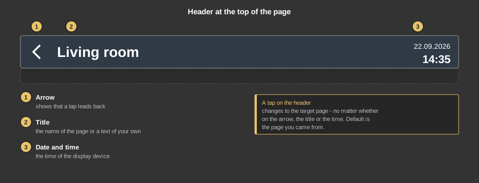
A tap anywhere on the header changes to the target page. Default is the page you came from. On Android the back key of the device does the same.
Tip: If the toolbar of the APP is hidden, it comes back when you keep a finger anywhere on the visualization for 15 seconds.
This section is meant for the installer of the system.
The target page is chosen with a right click on the element: in the submenu Target page (with search field) a certain page, or Back to the calling page (default). Go to page and Delete connection only appear if a page is linked. Without a target page a tap does nothing.
Colours and background come from the style (section header), see Styles.
Display |
|
| Text | Title of the header. Default is the name of the page. A line break is inserted with \n, two lines at most. The font size is set in the text properties. |
| Time | Shows date and time at the right edge. Default on. |
| Icon left | Shows the arrow at the left edge. Default on. |
Page call |
|
| Note user | The page is only changed if the user logged in is linked to the target page. A page without users is open to everybody. See User administration. Default off. |
In older projects an additional arrow may appear at the right edge; it can no longer be set.
See also General properties of all control elements.