 Block colour selector RGBW
Block colour selector RGBW
Block colour selector RGBWThis control element sets the colour of a coloured light, for instance an LED strip. The colour is picked in the colour wheel; brightness, white share and five favourite colours for quick recall complete it. Switching times, the behaviour on presence and absence and a presence simulation round off the operation.
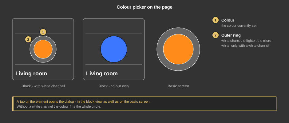
A tap on the element opens the dialog. As a circle (basic screen) the element shows the same, only without a caption.
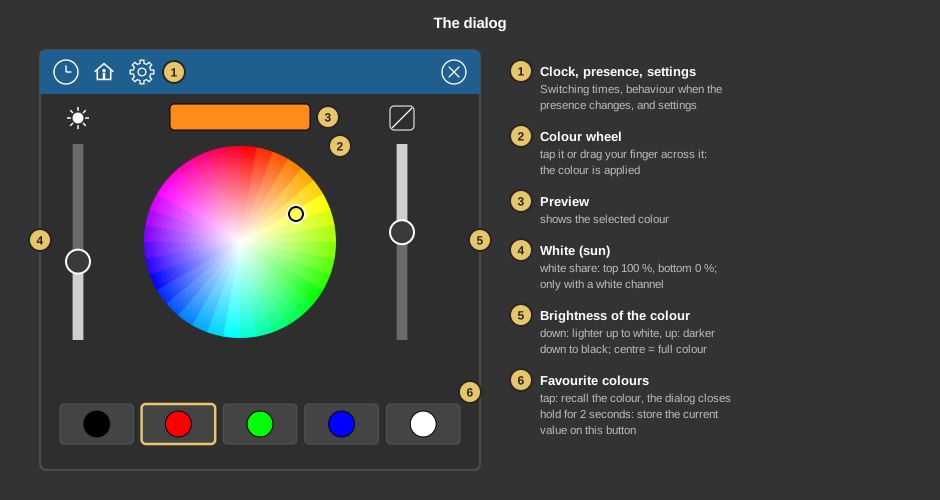
Behind the clock are switching times that set a colour at a certain time – on request only when it is bright or dark. Everything else about switching times is described under Presence.
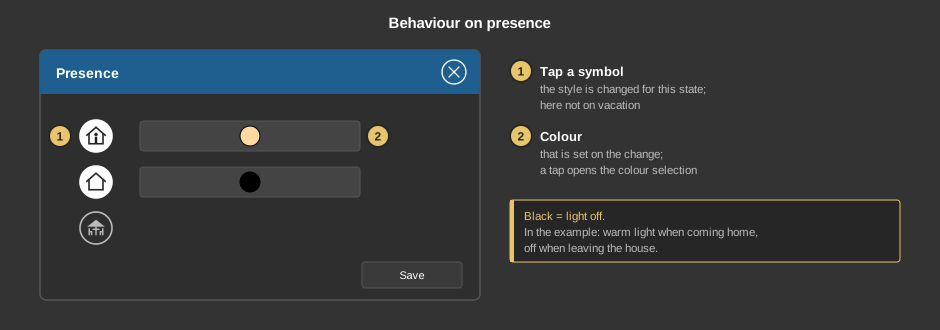
Behind the house you define which colour is set when the presence changes. A tap on a symbol selects whether anything is switched at all in this state; a tap on the colour field next to it opens the colour selection. Black switches the light off. Ex works only Present is active, with white.
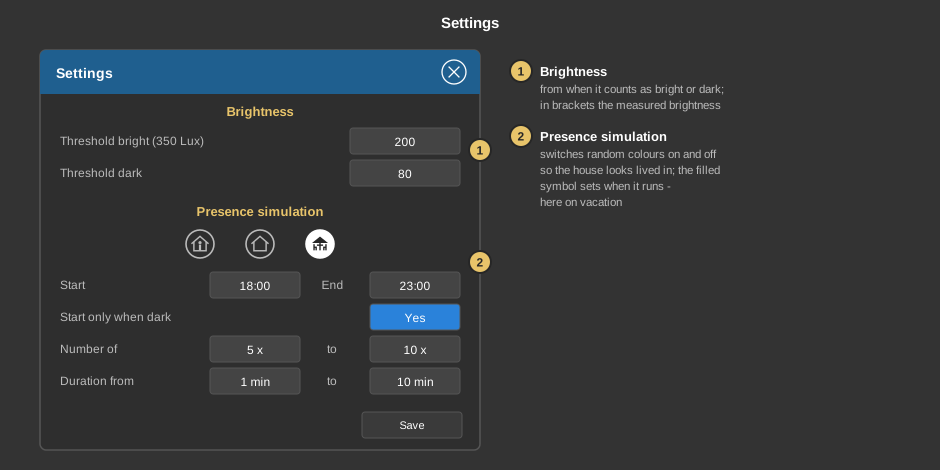
The gear wheel opens the settings. Save applies them.
| Brightness | Defines from when it counts as bright or dark: Threshold bright and Threshold dark, each in lux. The brackets show the brightness currently measured. The thresholds apply to switching times with “If bright” or “If dark” as well as to Start only when dark of the presence simulation and only take effect if a brightness value is available. Default for new elements: Threshold bright 1000 lx, Threshold dark 100 lx. |
| Presence simulation | Switches the light on in random colours and off
again so the house looks lived in. The three symbols select in
which state it runs – usually Vacation. When the
simulation ends, the light is switched off.
|
This section is meant for the installer of the system.
The control element comes in two variants:
The colour is output either via the three channels Red, Green and Blue or as one combined value RGBW; both at the same time is also possible. The single channels may be of type EIS 6 (relative value 0-100 %) or EIS 14 (counter value 1 byte, 0 to 255), the combined value of type EIS 18 (RGB 3 byte) or EIS 19 (RGB 6 byte, with white). The tile shows the values of these variables.
With the function block, switching times with bright/dark only work if its input Brightness is linked; otherwise the switching time does not offer this choice.
Display |
|
| Scene selection | Defines whether the element can be selected in the control element Block Scene group. Default: on. |
| View | Block (tile) or Basic screen (circle, e.g. for a floor plan). The third choice List(deprecated) comes from older projects and should no longer be used. |
| Text | Caption of the tile. Its size scales with the element, a line break is inserted with \n, at most two lines. |
With the variant presence all variables sit at the function block. With the variant standalone the following are linked at the control element:
| Red / Green / Blue | The three colour channels. They are sent as soon as a colour is picked in the dialog, and their values determine the colour shown. Optional if RGBW is linked instead. Not linked: this channel is not sent. |
| White | Optional. White channel, 0 to 100 % or 0 to 255. Not linked: the white slider in the dialog and the grey ring on the tile are omitted. |
| RGBW | Optional. The colour as one combined value (EIS 18 or EIS 19, with EIS 19 including white). Not linked: only the single channels are sent. |
See also General properties of all control elements.