 Block Header value display
Block Header value display
Block Header value displayLike the Block header simple this header shows the name of the page and leads back with a tap. In addition there are up to four displays at the edge: the time, values of the system such as the outside temperature, or the current weather.
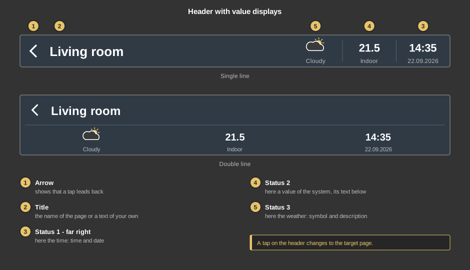
With single line the displays are to the right of the title; with double line the title is at the top and the displays share the lower line – this suits pages in portrait format.
A tap anywhere on the header changes to the target page. On Android the back key of the device does the same.
Tip: If the toolbar of the APP is hidden, it comes back when you keep a finger anywhere on the visualization for 15 seconds.
This section is meant for the installer of the system.
With a right click on the element:
Colours and background come from the style (section header), see Styles.
Display |
|
| Text | Title of the header. Default is the name of the page. A line break is inserted with \n, two lines at most. The font size is set in the text properties. |
| Icon left | Shows the arrow at the left edge. Default on. |
| Type | Single line or Double line, see above. Default on pages in portrait format double line, otherwise single line. |
Status |
|
| Status | The button ... opens the dialog Status: a preview
at the top, below it Type, Text and Format for each
status. Status 1 is at the far right, the others follow to the left.
Hidden status take no space, the title becomes wider instead.
|
Page call |
|
| Note user | The page is only changed if the user logged in is linked to the target page. A page without users is open to everybody. See User administration. Default off. |
| Status 1 (right) to Status 4 | Optional. Only for status of the type Value: the value is shown on every change. Not linked: 0 is shown. With the other types the variable is not used. |
See also General properties of all control elements.