 Block Shading Block Shading
This control element is used to control the shading. Depending on the sun position and brightness, the blind is closed or opened (glare protection). Optionally, the room temperature can also be taken into account; in that case the blind is moved down when the room temperature exceeds a threshold.
This control element can be used to group several blinds together. For example, it makes sense to shade all blinds on one side of a room at the same time. Therefore this function is not integrated into the Blind control element but implemented as a separate control element. Which blinds are grouped together is defined during configuration.
The control element is available in two different views, Block and Basic Screen. Depending on the design of the visualization, the element is displayed in the following two variants:
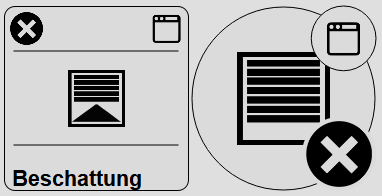
The current state of the shading is represented by the following symbols:
 |
Sun position for
shading on reached. |
 |
Brightness for
shading on reached. |
 |
Temperature for
shading on reached |
 |
Shading
deactivated |
 |
Shading active
on |
 |
Shading inactive
off |
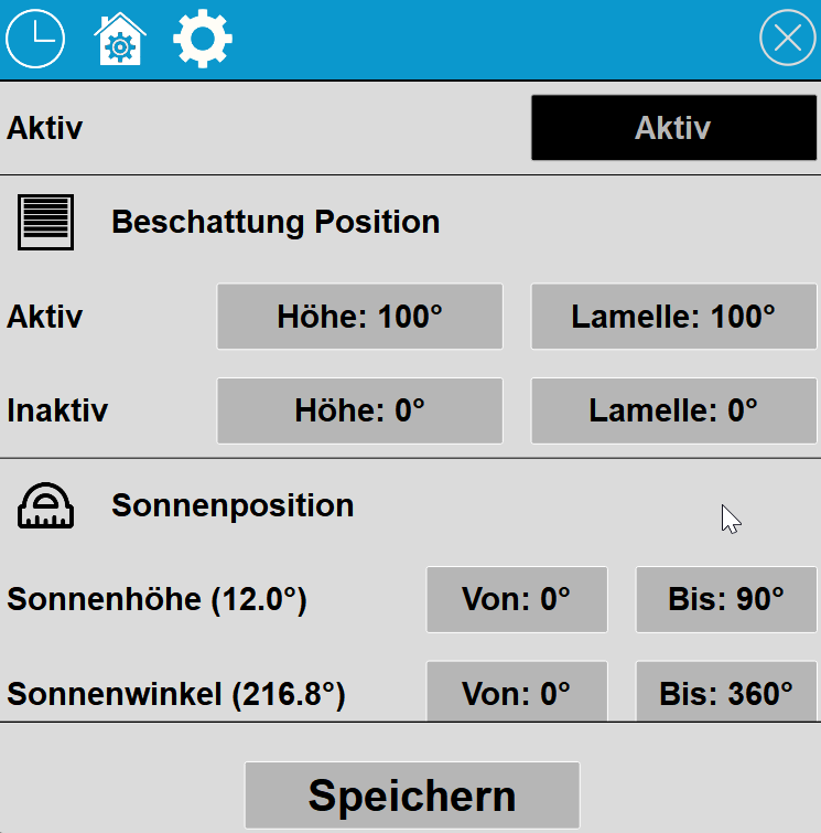
Clicking on the control element shows the following dialog:
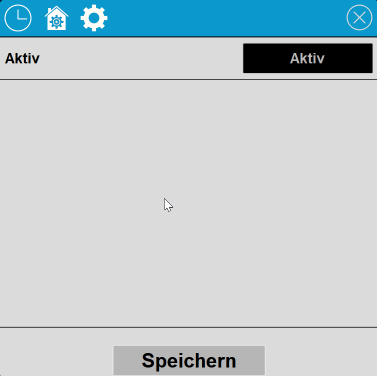
The shading can be activated with the Active/Inactive button.

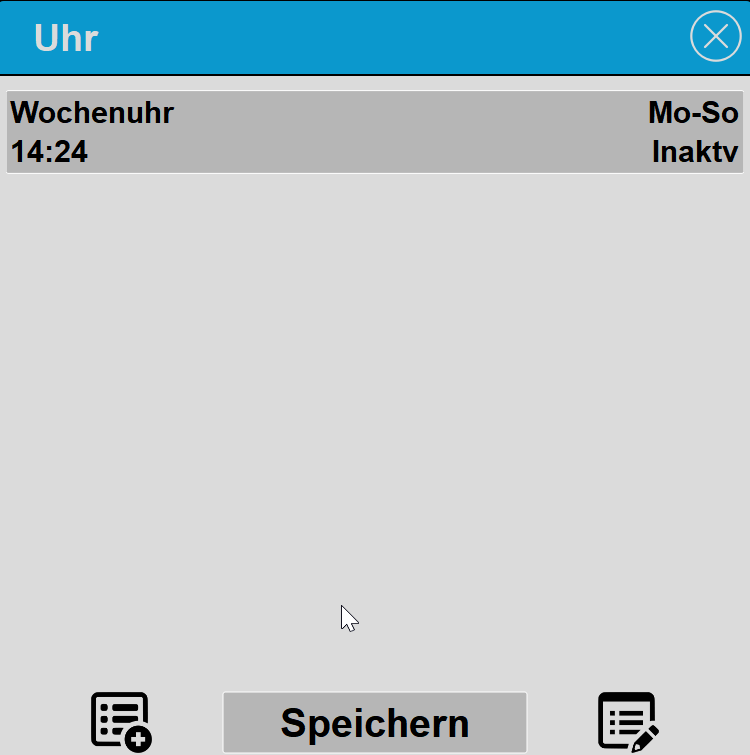
With the Time switch function, the lighting can be switched in a time-controlled manner. To add a new switching time, press the symbol at the bottom left; to delete or sort switching times, click on the symbol at the bottom right.
Using the calendar icon in the switching time list, switching times can be imported from a calendar file (iCal, *.ics) - via a link (including Google Calendar, Apple iCloud, Google Drive and Dropbox), from a file or from the clipboard. One on (value 1) and one off (value 0) switching time are created per event. For details on the import see Block Time switch; where to find the calendar links in the respective services is described in the help of the Holiday time clock.
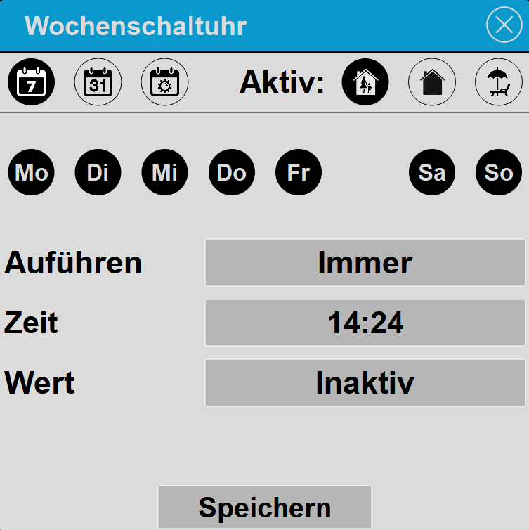
In the first line, the symbols for the type of clock and presence are shown. On the left side the type of clock is set. The type can be set to Week clock, Date and Sunrise/Sunset. On the right side it is set when the clock should be active (dark background means active).
On the right side it is set when the switching time should be active: Present, Absent and Holiday. This can be used, for example, to select that a switching time is only executed when you are present, but not when Absent or on Holiday. If none of the three symbols is active, the switching time is not executed; the overview then shows Clock deactivated.
Under Execute, once or always can be selected. With once, the symbols Present, Absent and Holiday are deactivated again after execution, and thus the switching time is also deactivated.
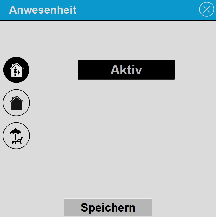
Via this dialog, the shading can be switched active or inactive when the Present status changes. For example, the shading should only be active when Present.
Display |
|
| Display | Display Block, Basic Screen or List. |
| Text | Text to be displayed. The size of the text is automatically scaled with the control element. Line breaks can be inserted with the special character "\n", for example "Line1\nLine2"; a maximum of 2 lines is possible. |
Connected variablessee function block Structured Block Shading |
|