 Block Statistics Block Statistics
This control element is used to display statistics.
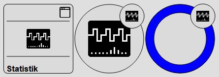
The control element is available in two different views, Block and Basic Screen. Depending on the design of the visualization, the element is displayed in the following two variants:
Clicking on the control element shows the dialog with the statistics:
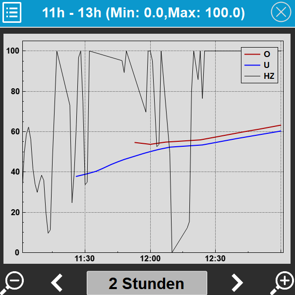
Depending on the configuration, the data is displayed accordingly. The display can be scaled horizontally via the +/- icons. The time range can be shifted with the left/right arrow icons. The time range can be set via the button in the middle:
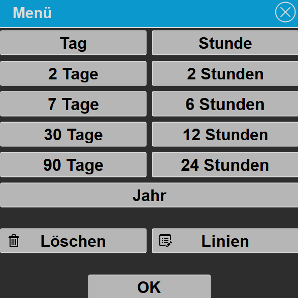
In this dialog several time ranges can be selected:
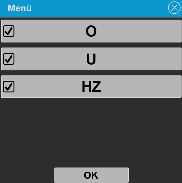
Individual lines can be selected or deselected via the checkmark.
A longer click on a data point in the chart shows a detailed evaluation of the visible range for the respective line, with the values Start, End, Number of DP (number of data points), Minimum, Maximum and Average.
Display |
|
| Display | Display Block, Basic Screen or List. |
| Text | Text to be displayed. The size of the text is automatically scaled with the control element. Line breaks can be inserted with the special character "\n", for example "Line1\nLine2"; a maximum of 2 lines is possible. |
Chart |
|
| Background | Background color |
| Font | Foreground color |
| Legend | Show legend |
| Scaling min. | Graph scaling. Min/Max value for chart. If Min/max equals 0, it is scaled automatically |
| Scaling max. | Graph scaling. Min/Max value for chart. If Min/max equals 0, it is scaled automatically |
| Decimal places Y | Number of decimal places for the labelling of the Y axis. |
| Parameter | Opens a dialog via the „...“ button for configuring the individual lines in the chart. For each line the following can be set: Active (show line), Name (name in the legend), Type (Linear, Rectangle, Linear+filling, Rectangle+filling or Bar), Line thickness, Line color as well as Factor and Offset for converting the raw value. |
Progress/Value |
|
| Show | Show progress / value on the control element. |
| Formatting | Value display formatting, see Formatting |
| Type |
|
| Minimum | Display scaling |
| Maximum | Display scaling |
| Factor | The value of the Value display variable is multiplied by this factor, e.g. 0.001 to convert watts to kilowatts. The factor affects the numeric display as well as the progress circle. A value of 0 is calculated as 1. |
| Positive + | Color of positive value |
| Negative - | Color of negative value |
| Tip: If the Background
parameter is not selected under Transparency settings, only the
icon is displayed. This makes it easier, for example, to place the
element over another element. |
|
Connected variablessee function block Structured Block Statistics |
|