 Block Menu Bar
Block Menu Bar
Block Menu BarThe menu bar is a navigation bar at the bottom edge of the page: each entry shows a symbol with a label and leads to a page with a tap. The page you are currently on is highlighted. The first entry is always the Home page, added automatically. Further pages can be kept ready behind the entry More, which always appears automatically as the last entry of the bar; Favorites is placed in front of it automatically.
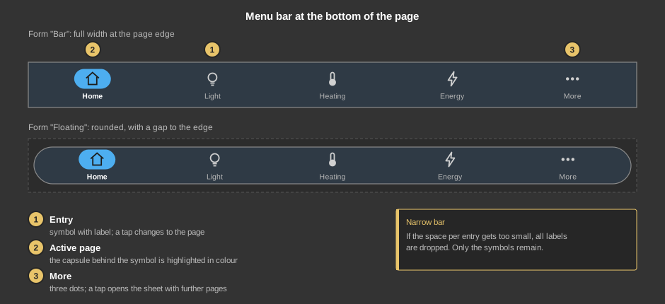
The menu bar comes in two forms. The bar spans the full width up to the page edge. The floating form is a rounded capsule with a shadow and a little gap to the edge.
Swiping: If set up, swiping left changes to the next and swiping right to the previous page of the menu bar – anywhere on the page as long as it is not zoomed. Only the entries that lead directly to a page are used, in the order of the menu bar; after the last (or before the first) page it does not continue. If you are on a page behind More, swiping has no effect.
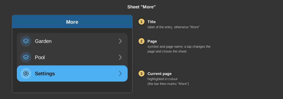
If Note user is switched on, the sheet only lists the pages the logged-in user may change to.
This section is meant for the installer of the system.
The menu bar is placed on every page from which it shall be used to change pages – easiest by setting it up once, copying it and pasting it into the other pages. It needs no link to addresses or function blocks: it only changes between pages of the project, and which page is active follows from the page it is placed on. The height of the menu bar determines the size of the symbols and the text; if the bar is made wider or taller, everything grows with it.
Colours and background come from the style (section footer, the highlighted capsule in the accent colour of the style), see Styles. If no style is selected, the colours of the template „Light“ apply.
Menu bar |
|
| Form | Bar (default): the bar fills the control element and touches the page edge with a fine line at its upper border. Floating: a rounded capsule with a shadow that leaves a little gap to the border of the control element all around – make the control element somewhat taller for this. |
| Entries | The button ... opens the dialog
Menu bar - Entries with up to 8 page entries. Each entry has the columns
Page, Label and Symbol; Add and
Remove create entries or delete the selected one, the arrows set the
order. The entry Home page is always at the very left and cannot be
changed. The entry More is always added
automatically as the last entry and has only one button in the dialog,
Select pages in „More“ .... The columns:
If the bar is too narrow for each entry to be at least about 80 % of the bar height wide, all labels are dropped and the symbols become slightly larger. This also applies if no entry has a label (the word „More“ does not count). |
Page call |
|
| Page change slide hor. | Changing by swiping left or right anywhere on the page (not when the page is zoomed), see above. Default off. |
| Note user | The page is only changed if a user is logged in and linked to the target page. A page without linked users is open to every logged-in user. If the project has no users, all pages are offered. If there are users but nobody is logged in, no page is changed at all. This applies to the entries, to swiping and to the list in the sheet More. See User administration. Default off. |
The symbol selection is split: on the left are the symbols of the program, on the right the graphics from the project. The right side lists all graphics imported into the project in the SVG format (other formats such as PNG are not offered). First import a graphic into the project (project graphics selection), then choose it in the symbol selection. On the button a project graphic shows the file name with the addition „(Project)“. File names containing #, ;, , or ~ are not offered.
For the colour of the graphic to change at run time (light or dark according to the style, accent colour for the active entry), the SVG file has to be built as follows:
currentColor: wherever the graphic is
to be coloured (line stroke or area fill), use the
word currentColor. The program replaces this word with the
suitable colour when drawing. Fixed colour values such as
#000000 stay unchanged and cannot be recoloured. A graphic
without any currentColor is drawn in its own colours.viewBox: viewBox="0 0 24 24"
is recommended. The graphic is fitted proportionally and centred in the
symbol field; without viewBox the size depends on
width and height.<image>), no
filters, gradients or fonts. Please convert text to paths.<style> or classes but directly in the
fill and stroke attributes of the elements. The
replacement works on the text of the file and finds
currentColor anywhere, but a style block with fixed colours
would override it.fill="none", use a line
width of about 1.5 to 2 (at 24 units edge length) and round the ends with
stroke-linecap="round" so they match the symbols of the
program. Transparency via opacity is possible.Example (triangle with dot):
<svg xmlns="http://www.w3.org/2000/svg" viewBox="0 0 24 24">
  <path fill="none" stroke="currentColor" stroke-width="1.8"
        stroke-linecap="round" stroke-linejoin="round" d="M4 20 12 4l8 16Z"/>
  <circle fill="currentColor" cx="12" cy="15" r="1.6"/>
</svg>
The graphic is loaded from the project. If it is replaced there, the new version is drawn after reloading the page or restarting the app.
See also General properties of all control elements.