 Block Goto page
Block Goto page
Block Goto pageThis control element changes to another page of the visualisation – typically from a menu into a room. On request it already shows how many lights are on in that room, and a value such as the room temperature.
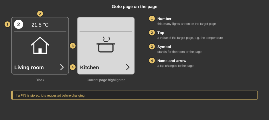
If a PIN is stored, it is requested before changing – for settings pages that not everybody should open, for instance. In a menu the element of the page currently open can be highlighted (on the right in the picture). As a circle (basic screen) it shows the symbol and the number at the top right.
This section is meant for the installer of the system.
The target page is chosen with the right mouse button on the element.
Display |
|
| View | Block or Basic Screen. The third choice List (deprecated) comes from older projects and should no longer be used. |
| Text top | Text in the top row. If an actual value is linked, it stands in front of the value, for instance “Temp. ”. |
| Text bottom | Caption of the tile. Its size scales with the element, a line break is inserted with \n, two lines at most. |
| Status | Shows the number of lights switched on on the target page. Counted are the control elements Light/dimmer block, Colour temperature control block and Block switch with the option Page change status switched on. |
| Depth | Only with Status. How far nested page calls are
counted as well:
|
| Page structure | Only with Status. The button shows the target page and all pages reachable from it as a menu with the respective depth. A click on an entry takes over the depth. |
| Inversion display | Shows the element inverted while its target page is open – that way a menu highlights the current page. |
Icon |
|
| Symbol | Only in the new block design. Symbol in the centre: a program symbol or an SVG graphic imported into the project (see Block Menu Bar, section „Your own graphics (SVG) as symbol“). It is coloured to match the style, separate graphics for light and dark are not needed. The button x removes the symbol. Empty: the light/dark graphics or a standard symbol. |
| Icon style theme dark / light | Symbol in the centre, separately for dark and light styles. Empty: a standard symbol. In the new block design the two fields only appear if they are filled in the element. |
| Zoom | Size of the symbol in percent of the available area, default 60. |
Display value |
|
| Format | Format of the actual value, see Format specifications. Default %.0f. |
| Factor / Offset | The actual value is multiplied by the factor and the offset is added. Default 1 and 0. |
Page call |
|
| Note user | The page is only changed when the logged-in user is linked to the target page. A page without users is open to everybody. See User management. |
| PIN | Optional, four digits. Requested before changing the page. |
| Actual value | Optional. Value shown in the top row, for instance the room temperature of the target page. Not linked: the top row only shows the Text top. |
See also General properties of all control elements.