 Block Header
The header sits at the top of the page and shows the name of the page. Tapping it goes back or to another page. It exists only in the new block design and replaces the two previous headers simple and value display there. It shows title, symbol and subtitle, optionally a floor selector and a message when faults are pending. On the right there are up to four status items, by default the time with the date. Without the new design the element only shows a notice and does not react.
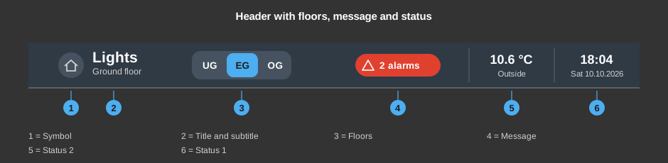
Tapping anywhere on the bar, not on a button in it, switches to the target page. If no target page is set, nothing happens. On Android the back key of the device works the same way. The tapped button or bar briefly shows a border in the accent colour.
It shows the pending faults of the Block Fault messages function block, unacknowledged ones first, each with its duration. Acknowledging is not done there but in the Block Fault messages control. If a page is set for the messages, the button To page ... at the bottom leads there.
This section is intended for the installer of the system.
The header fills the box defined in the editor. If the box is taller than needed, the content keeps its size and is centred; if it is lower, everything shrinks evenly. Whether it appears as a bar or floating is set by the parameter Form – the same as for the menu bar. Colours and shadow come from the style, see Styles.
With the right mouse button on the element:
Display |
|
| Form | Bar: the header fills the control element, is square, has no shadow and shows a fine line at the bottom – for a header across the whole page width. Floating: a rounded capsule with a shadow and a fine border that leaves a little gap to the border of the control element all around. The rounding is the same as for the floating menu bar. Existing headers keep their previous look: bar across the whole page width, floating otherwise. |
| Text | Title of the header. Default is the name of the page. A line break is inserted with \n, two lines at most, text that is too long ends with "...". |
| Symbol in front of the title | A symbol from the symbol selection. Default none: then the symbol of the page (page properties, Symbol) is shown, if one is set. |
| Subtitle | None (default), Floor (full name of the floor whose page is open; it must be entered in the dialog Floors) or Text (the text of the field Subtitle text below it). The small line below the title. |
| Hide Present/Absent symbol | Unchecked (default), the symbol is always visible; without a Block Presence in the project it is greyed out. Checked, the symbol is missing altogether and the title uses the space that becomes free. This also applies if the project contains a Block Presence. |
Status |
|
| Status | The button ... opens the dialog Status values with one row per status and the
columns Type, Text and Format. The toolbar adds a status (+, four at most),
deletes the selected one (−) and changes the order (up / down).
Status 1 is at the far right, the others follow to the left; status items that are not created take no space.
Apply transfers the changes to the page at once, the dialog stays open.
|
Floors |
|
| Floor selector | Off (default), Beside the title (right after the title) or Own row (below the title across the full width). The selector appears only with at least two floors entered. |
| Floors | The button ... opens the dialog Floors with up to eight rows: Page (the page the button opens; the button opens the page menu with search field as for the page call), Short name (text on the button, e.g. GF) and Name (full name, e.g. Ground floor). Every floor is a page of its own; the button of the page that is currently open is highlighted. The order of the rows is the order of the buttons. |
Page call |
|
| Users | No setting: the page is changed only to pages assigned to the logged-in user. A page without users is open to everyone, even without logging in. Also applies to the floors and the page of messages. See User management. |
| Status 1 (right) to Status 4 | Optional. The addresses appear only for created status items of the type Value; the addresses move with the status when it is moved and are lost when it is deleted. The value is shown on every change. Not linked: 0 is shown. |
The addresses of the Block Fault messages function block come only from the link (right mouse button), they do not have to be entered by hand.
See also General properties of all controls.